


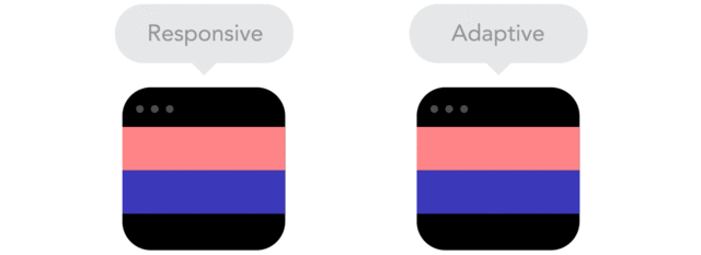
With mobile devices becoming the primary way we access information quickly it's become clear that websites needed to function on mobile devices. This is where responsive design comes (RWD) in. Sites built using RWD fluidly transitions from device to device using relative rather than static units and often are built using a mobile first approach. This means your site is accessible across all devices. Until recently many sites used an adaptive approach which had a separate grid for each device, resulting in slower loading times. In addition, as devices change they don't maintain the same screen size, meaning the templates had to be changed every time a new device was released. The gif below is one of th best ways to describe responsive vs adaptive design.
So what is responsive design?
Responsive Design can be best explained as a website designed using CSS3 media queries, flexible images and fluid grids based on relative units rather than absolute units on static grids. Without the technical terms: RWD uses code to make a website compatible to all devices.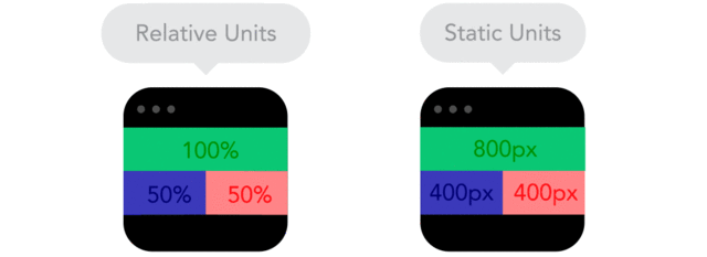
A great way to check if your site is responsive is to resize the window, if the website adjusts smoothly than it's a safe bet that it's responsive if not your website is probably either adaptive or just built for desktop. Go check out my website and resize the window or you can even do it with this blog!
Do I need to have a responsive site?
In short, yes you do. Responsive sites are designed to be compatible with all devices from Apple to Android, phones to desktops. Having a site that is not device friendly quickly means you an lose business and makes your site obsolete. Think about it this way. If you have someone refer you to a potential client then that potential client will probably Google you on their nearest device (often their phone or tablet) now if your site is not compatible for these devices the potential client will likely become frustrated because they can't view the site properly, exit the site and you've lost their business. In addition responsive sites often have far quicker load times making your site even more accessible.Does this mean I need to have my whole site redesigned?
This is a hard question to answer because I don't know how your site has been set up. Some sites will be very easy to adapt to a responsive framework whilst others may have to be completely reworked. If you would like to find out if your site can be made responsive you can email me here or talk to your designer or developer.I'm a designer, how does RWD effect me?
One of the main focuses of RWD is flexible images. When creating logos, icons, and complex graphics that hold detail and are likely to be scaled you want to export them as a vector (.svg format is often considered best) this way the graphic maintains its quality. For images you can stick with png and jpg format. :)
Where can I learn more?
If like me the technical code and theory behind RWD intrigues you, there are some great articles out there. Some of my favourites are:- The 9 Basic Principles of Responsive Web Design
- Responsive Web Design: What It Is and How To Use It
- Responsive or Adaptive - which is better?
Notes
If you have any questions, want to know more or if you need a responsive site designed and developed. Come say hi and send me an email here and we can talk!*the amazing gifs are sourced from froont
No comments:
Post a Comment